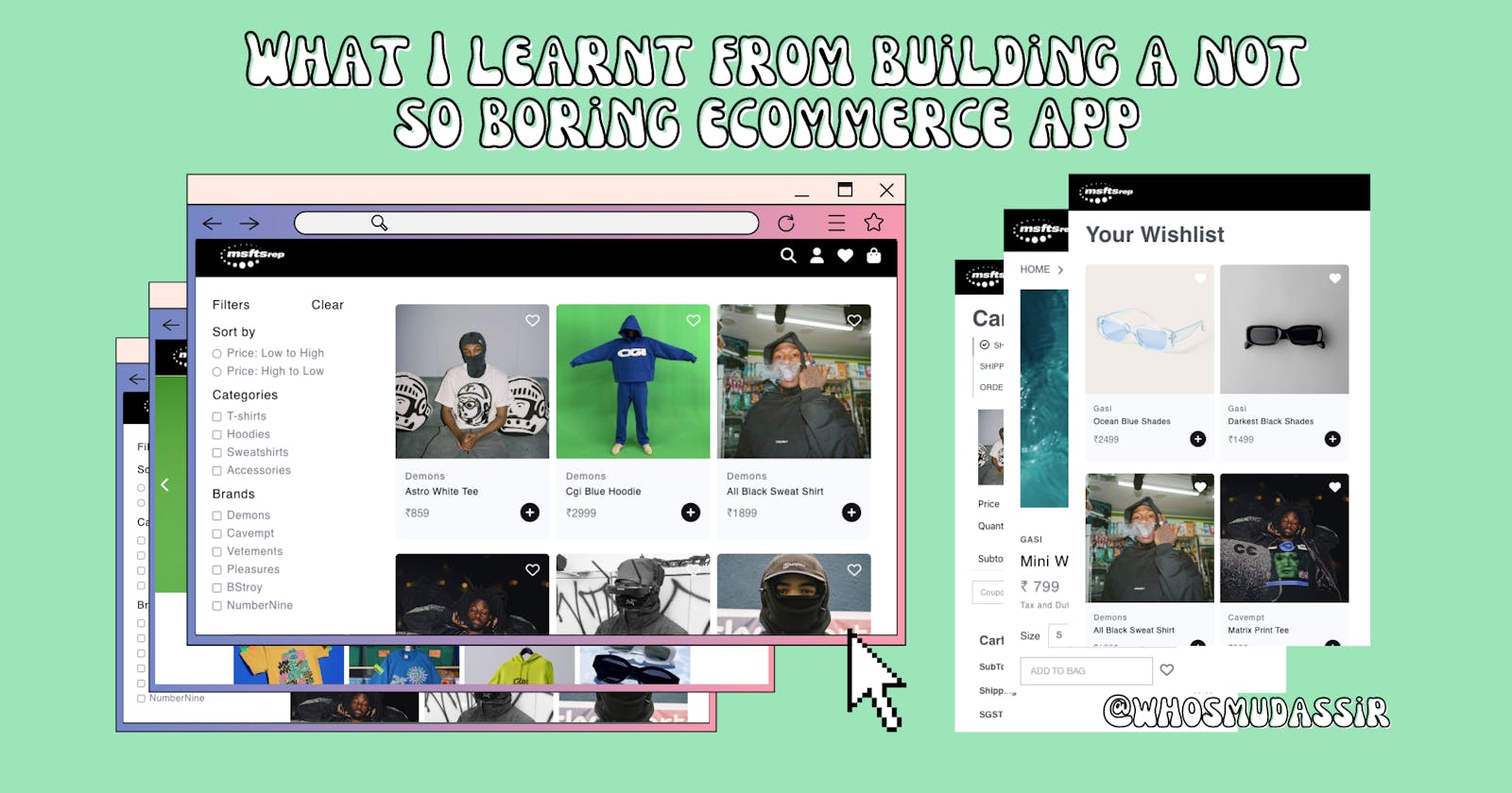
What I learnt from building a not so boring ecommerce app
ReactJs + RainbowUI + Zustand + Few design tips
Table of contents
The sole purpose of this side project of mine was to learn little bit about backend, especially get my hands dirty with NodeJs, Express, MongoDB.
Which I still haven't had a chance to, so this article is going to be about stuff at the frontend side, most importantly what I learnt using React, RainbowUI, ReactRouter V6, Zustand, TypeScript. Also how you can improve your next project aesthetics with few simple design tips.
⚛️ ReactJs
Things I learnt :
Forms and validations
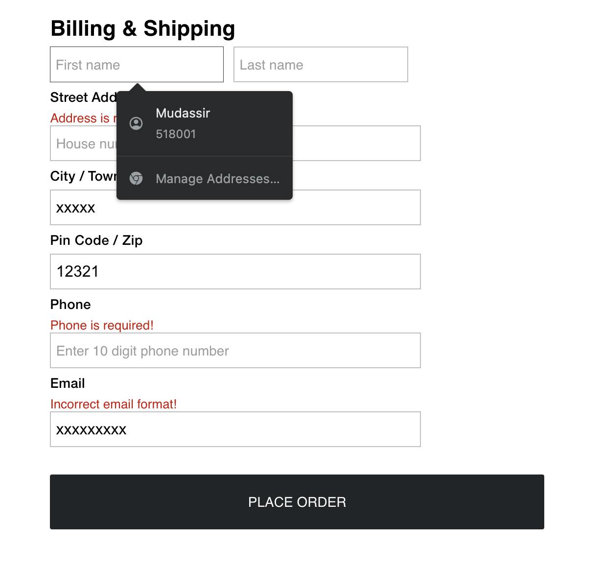 Autocomplete attribute in Input fiels : Autocomplete allows the browser to predict the value. When a user starts to type in a field, the browser should display options to fill in the field, based on earlier typed values.
RegEx Validating : It is essentially a syntax check which makes it possible to see whether an email address is spelled correctly, has no spaces, commas, and all the @'s, dots and domain extensions are in the right place.
Multiple filtering and sorting
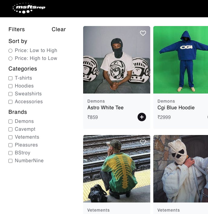 Updating state on every checked box and sort.
Carousel component

A slideshow component for cycling through elements, images or slides of text — like a carousel.
ReactRouter V6
React Router is a fully-featured client and server-side routing library for React. It runs anywhere React runs - on the web, on the server with node.js, and on React Native.
There has been a lot of under the hood changes in version 6, be it an enhanced path pattern matching algorithm or addition of new components. Not only that but the bundle size has been reduced by almost 58%.
Here are some of the changes you can make to upgrade an existing project from React Router v5 to v6.
~ Switch replaced with Routes
~ Changes in the way we define our Route
~ The exact prop Is not needed anymore
// In V5 :
import { Switch, Route } from "react-router-dom";

<Switch>
    <Route path="/">
        <Home/>
    </Route>
    <Route exact path="/shop">
        <Shop/>
    </Route>
    <Route exact path="/user/:userId">
        <UserProfile/>
    </Route>
</Switch>
// In V6 :
import { Routes, Route } from "react-router-dom";

<Routes>
   <Route path="/" element={<Home />} />
   <Route path="/shop" element={<Shop />} />
   <Route path="/user/:userId" element={<UserProfile/>} />
</Routes>
🌈 RainbowUI
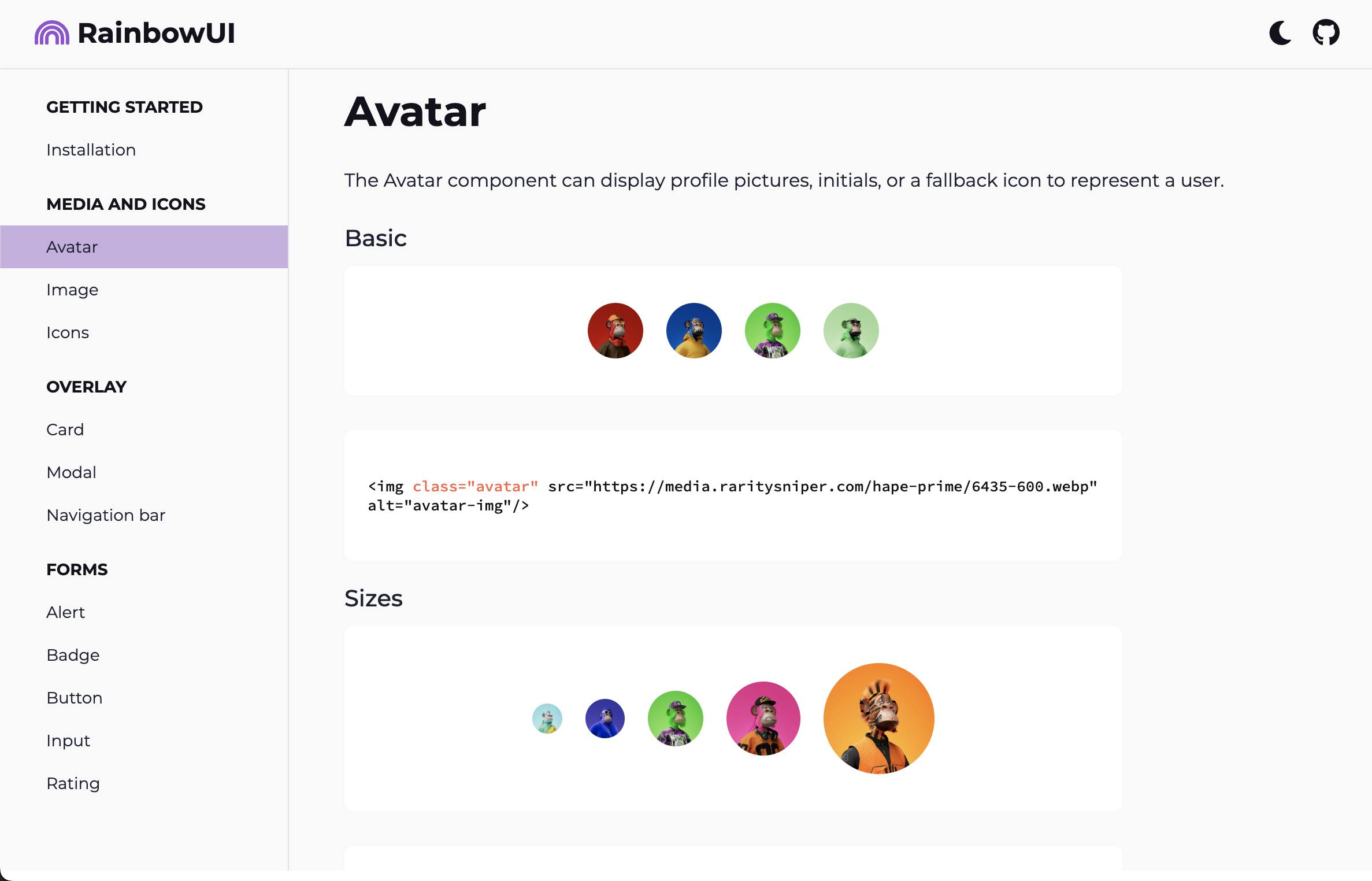
My very own component library built using Vanilla JS.
Things I learnt :
How component libraries work
I was always curious about how component or UI libraries worked, and how CSS was preapplied by just assigning classnames. It's actually a lot simpler than it sounds. I'll talk more about component libraries and how to build your own in the next blog.
Persistent Dark mode theme
Can be done by storing user preferred theme state to local storage. Here's a really good article on how to achieve it.
🐻 Whats Zustand
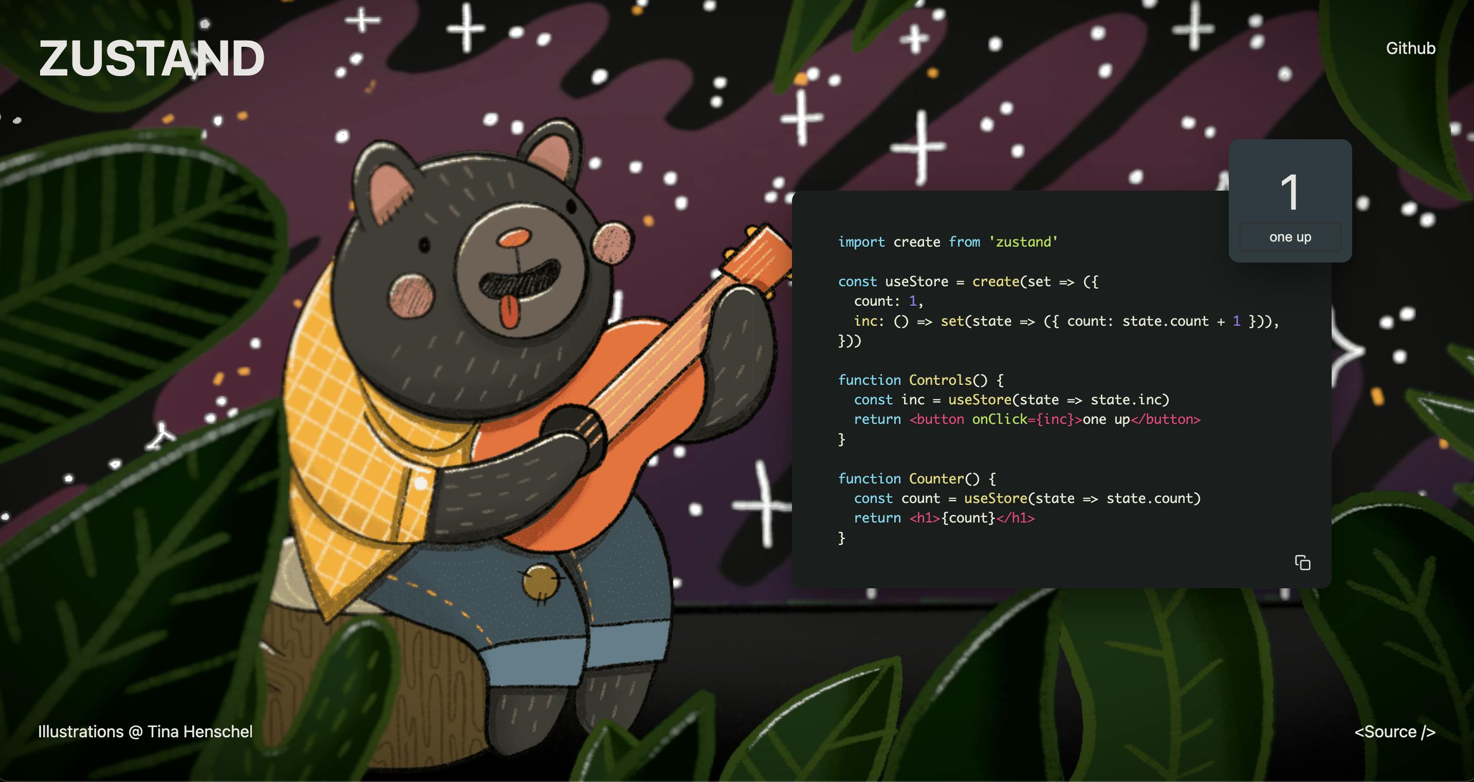 A bolierplate free state management solution, unlike Redux.
I'm not going to argue against the fact that both redux and zustand are great libraries with their use cases.
But coming from redux, I decided to try zustand for fun - and I was blown away by how straightforward it is. Having used zustand for a while, I felt depressed thinking about the time I spent boilerplating in redux, debugging actions, side effects...
Things I learnt :
- State management can be simple
🦄 Design, colors, layouts
Things I learnt :
Hierarchy
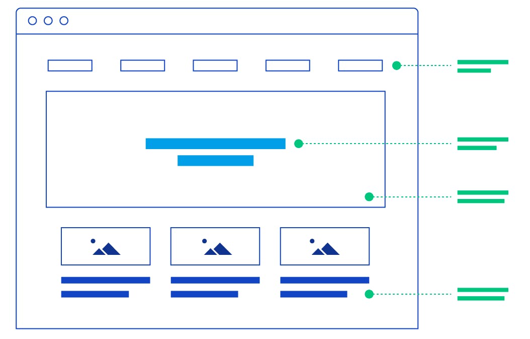
A good front-end developer will respect design relationships and hierarchy. A great developer will understand them.
Pay special attention to how the design works with hierarchy. How close are the titles to the body of text? How far are they from the text above them?
How does designers seem to be indicating which elements/titles/text bodies are related and which aren’t? They’ll commonly do these things by boxing related content together, using varying white space to indicate relationships, using similar or contrasting colors to indicate related/unrelated content, and so on.
Typography makes all the difference
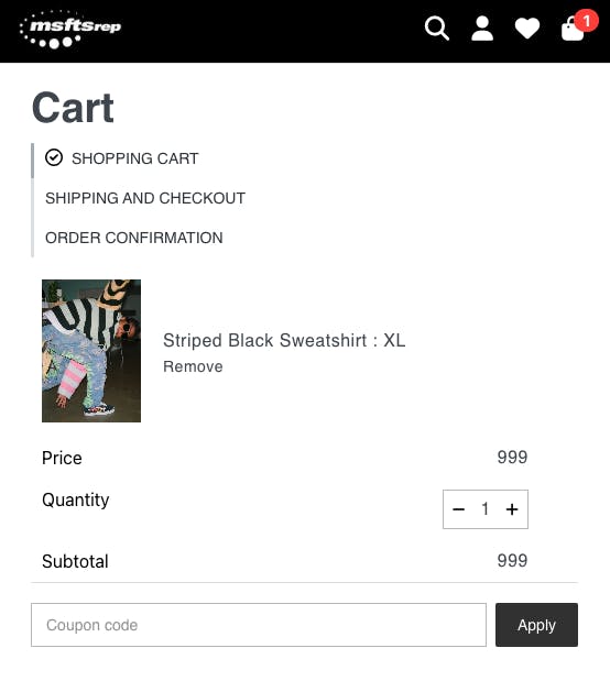
End look of a design is heavily influenced by typography. You’d be surprised to learn how much time designers spend on it. This is not a “pick-it-and-go” endeavor, some serious time and effort goes into it.
If you end up in a situation where you actually have to choose typography, you should spend a decent amount of time doing so. Go online and research good font pairings. Spend time trying those pairings and making sure you end up with the best typography for the project.
Be picky about whitespaces
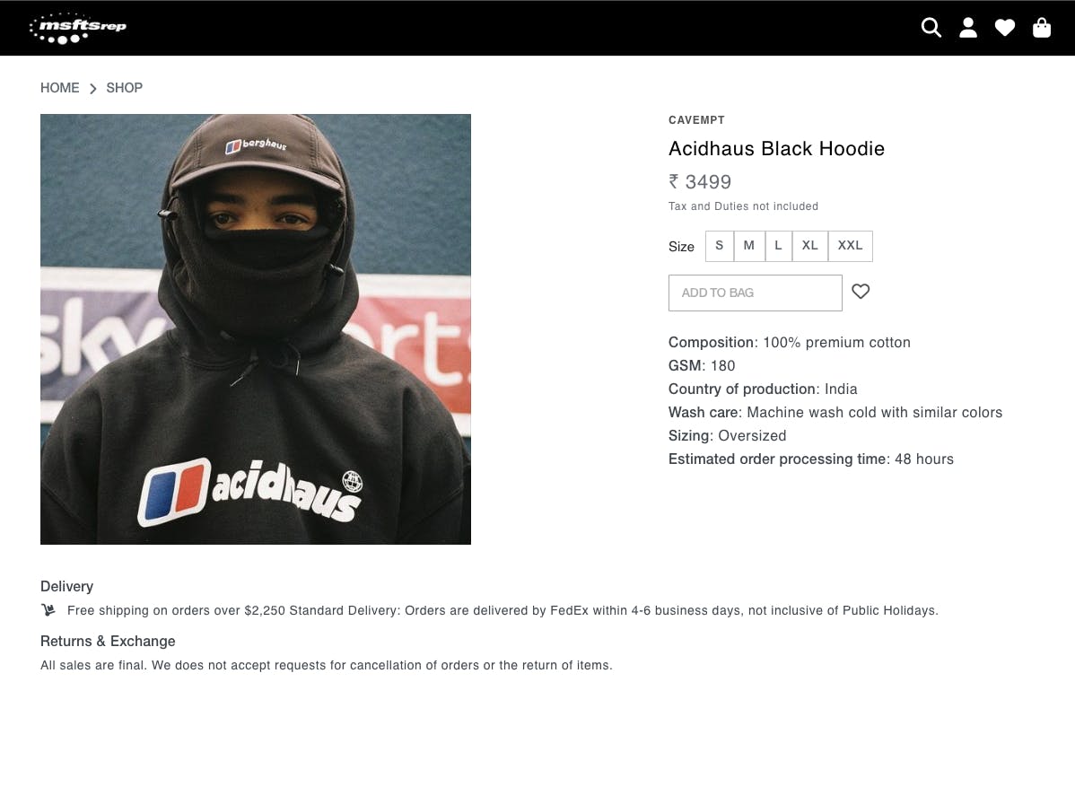
If You Don’t Know What You’re Doing, Do Less
This is a really drop-dead simple way for someone with no eye for aesthetics to make a significant improvement quickly. Make sure your elements are aligned down to the pixel, and that the spacing around every edge of every element is as uniform as possible.
For example, If the design seems to be using spacings of 20 units, 40 units, etc., then make sure every spacing is a multiple of 20 units.
Take time between revisions. Come back later to see your design work with fresh eyes.
👀 Stay tuned for the next blog
I'm gonna talk more about design theory and some other essential design principles for front-end developers.
And this article's my third entry for Hashnode's #4articles4weeks challenge, so please share this article everywhere if you found it helpful and also give this article a lot of reactions (👍,👏,💓...anything you want).
