You can write the best code in the world but if your website doesn't follow the most basic principles of design your app or page will probably fail in search score, user experience and much more. So, in this post we will dive into some essential design principles for developers or any other tech person who codes websites.
1. Let purpose drive the design 🎯
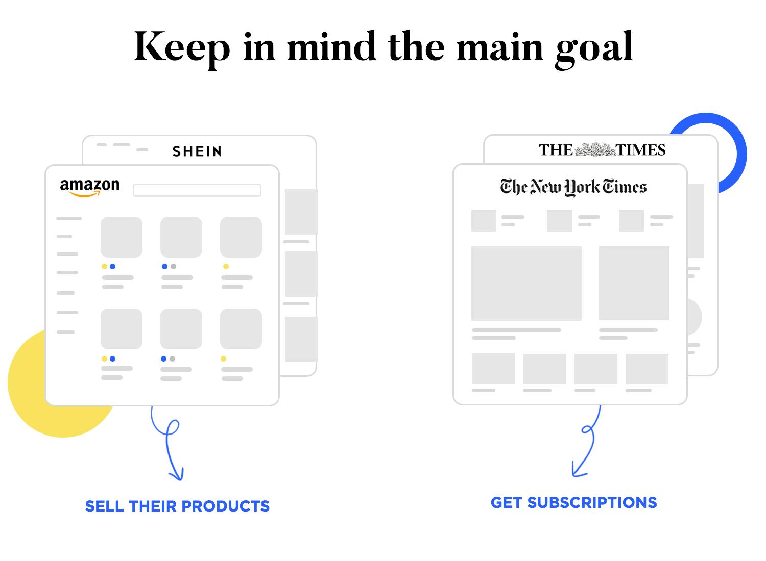
It is possible to be extremely creative in the realm of web design. Taking the design in unexpected directions, following some innovative desire to push the boundaries, is easy. In contrast, web design can also be goal-oriented, which means that creativity is not just blindly put on the web for people to experience.
There is always a goal in mind that makes design teams tweak every last detail, crafting a tailored design that seeks to achieve that goal. A classic example is ecommerce websites. There’s a huge margin for brands and designers to create a vibe, a visual identity that captures the soul of the store. However, the ultimate goal is always the same: to sell.
2. Visual Hierarchy 🧿
Visual Hierarchy is used to rank design elements and influence the order you want your users to view them. By using principles like contrast, scale, balance and more, you can help establish each element in its rightful place and help the most important elements stand out.
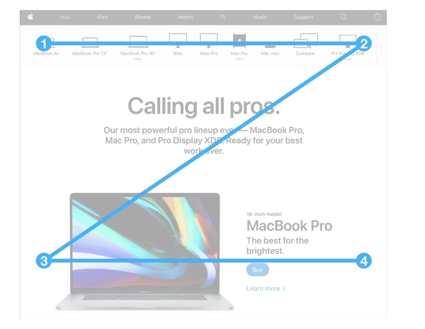
The Z pattern
This pattern is best used for content that is not text or content heavy. Designing your content to flow with this pattern will help your readers scan through a path from top-left to top-right, then down to the lower left, and across to the lower right quickly and get a sense of where you place the importance of each element.
The F pattern
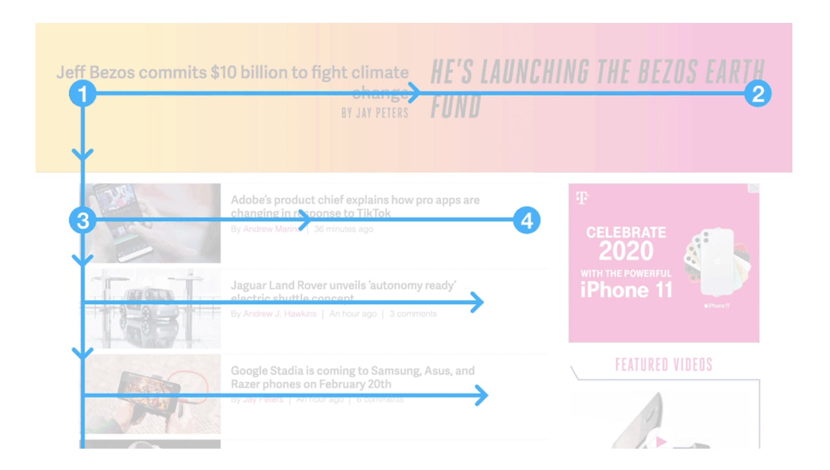
The F pattern for viewing is more prominently used on text-heavy pages such as articles and blog posts. In this pattern, viewers usually scan sites from the top left to the top right, then down to the next line from left to right, and so on. This is similar to the direction most of the western world reads.
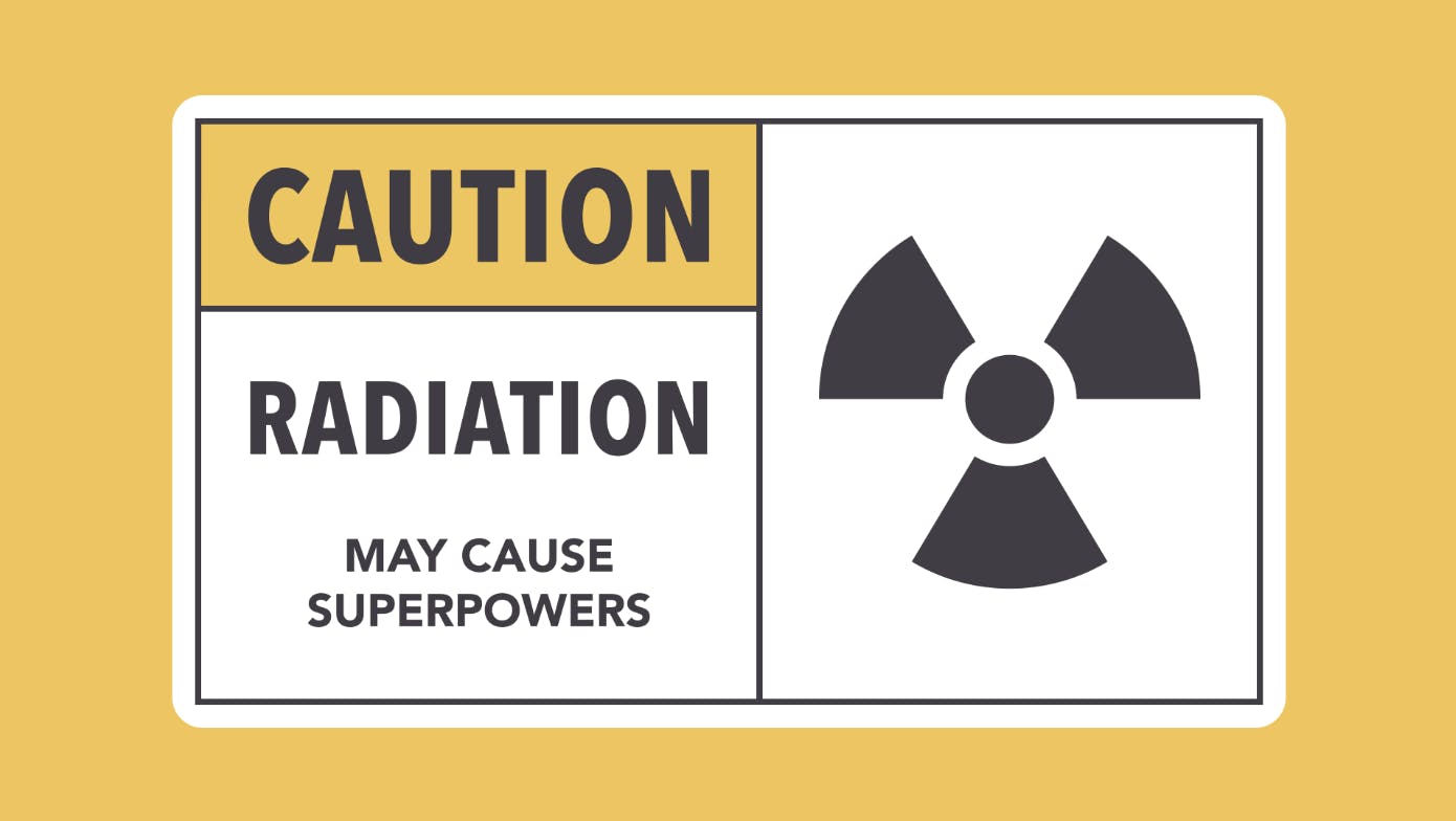
Using contrast to make objects stand out
Size, weight and colors can be used to give importance to elements in your design. Brighter colors are typically going to grab the viewer’s attention much more than dull, non-saturated colors.
Contrast simply means that one item is different from another. In layout and composition, contrast can help you do many things, like catch the reader's eye, create emphasis, or call attention to something important.
3. Typography 💬
Text needs to be clear, large enough to read, properly aligned, and needs to have enough color contrast for all users. Here are a couple of things to consider when working with type in your web design:
- Keep the number of fonts to a minimum. Rule of thumb: two is plenty, one is sufficient.
- Choose a typeface that works well in various sizes. Make sure that the typeface you choose is legible on smaller screens.
- Try to avoid fonts that use cursive script. They are difficult to read.
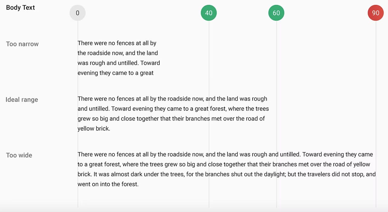
- Limit the line length of your sentences. You should have around 60 characters per line if you want a good reading experience. Having the right amount of characters on each line is key to the readability of your text.
4. Colors speak 🌈
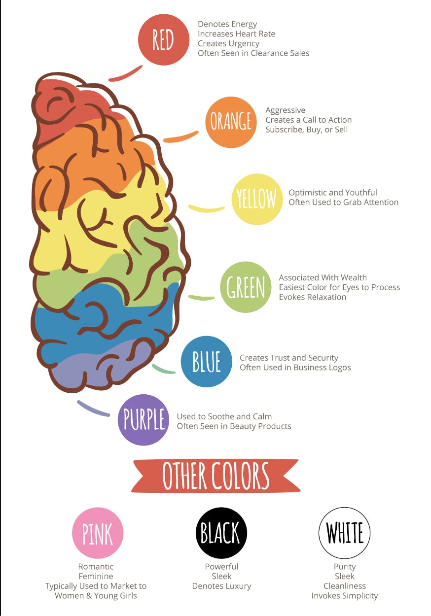
Color is a powerful communication tool and can be used to signal action, influence mood, and even influence physiological reactions. Certain colors have been associated with increased blood pressure, increased metabolism, and even eyestrain.
Here's a chart that describes what feeling colors communicate
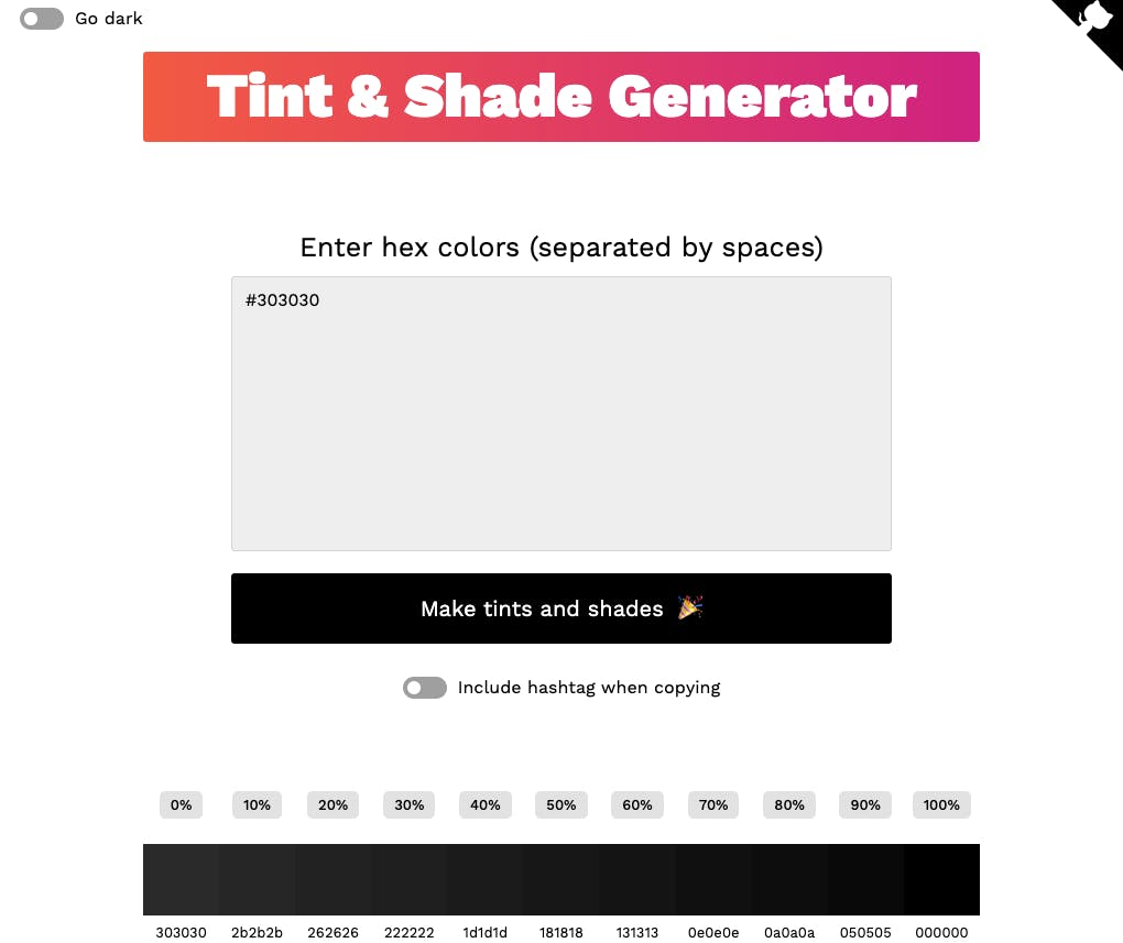
Later comes a stage where you will need more color shades than you think. There's cases where you need to use 3 different shades of a grey just in one screen and because that's pretty tough to choose the shades especially if you not a designer and what I recommend is using a tool called Tints and shades generator — that way you can't go wrong as it takes a while to develop an eye for good color combinations.
5. Proximity 👨👩👦
Proximity is all about using visual space to show relationships in your content. In practice, it's pretty simple—all you have to do is make sure related items are grouped together (for instance, blocks of text or elements in a graphic, as in the example below).
6. Layout and structure 🔨
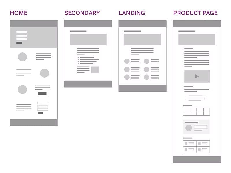
Now that you know the goal of your website and understand how texts, colors and visual hierarchy works, the next step is to start visualizing the structure of the components you are planning to include in your UI, play around with a couple of layouts on figma or just sketch it out.
7. Keep It Simple, Stupid (KISS) 😚
Last, but not least, is KISS (Keep it Simple, Stupid). It suggests that designs and systems should be as straightforward as possible. Wherever possible, complexity should be avoided in a system—as simplicity guarantees the greatest levels of user acceptance and interaction.
Use common user patterns and flows. It’s no coincidence that navigation is often at the top of a page, and the shopping cart icon on most websites looks the same.
In most cases, design from top to bottom and left to right. Use visual cues such as size and spacing to help users understand where to go and what to do. Make sure clickable elements, particularly buttons, look like they should be clicked.
When in doubt, remember: keep it simple, stupid.
I hope you found this helpful, do comment down your thoughts. And this article's my fourth and last entry for Hashnode's #4articles4weeks challenge, so please share it everywhere and also give this article a lot of reactions (👍,👏,💓... anything you want).
